This beautifully clear and uniform script may seem like a minor historical footnote, but its impact was profound. It rescued ancient knowledge from the brink of oblivion, facilitated the spread of ideas, and directly shaped the lowercase letters you are reading on this screen right now.
A Scribal Tower of Babel: The World Before Minuscule
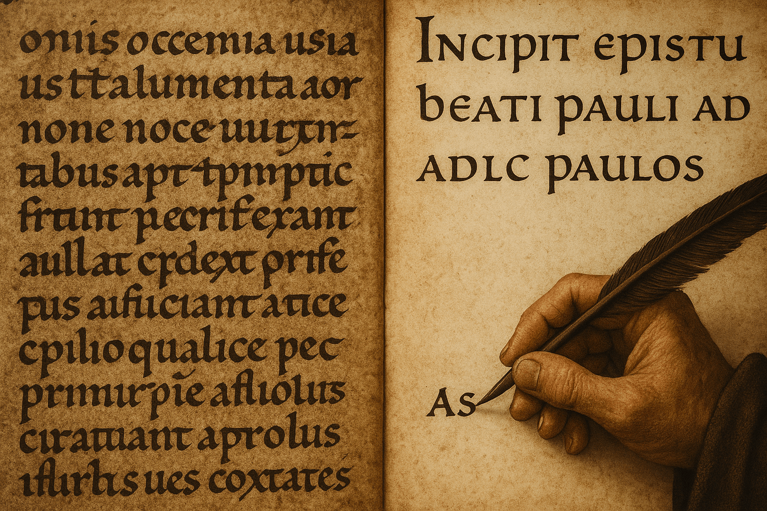
To understand why Carolingian minuscule was so revolutionary, we must first look at the chaotic world of writing that preceded it. After the fall of the Western Roman Empire, a unified writing system fractured along with its political structures. Across Europe, a dizzying array of regional scripts emerged, each with its own quirks and conventions.
In Francia, scribes used the Merovingian script, a cramped, ligature-heavy style where letters were often looped and joined together in complex ways, making it notoriously difficult to decipher. In Spain, the Visigothic script prevailed, while in Ireland and Britain, the beautiful but distinct Insular scripts developed. A scholar from Italy trying to read a manuscript written in a northern Frankish monastery would have faced a significant challenge, almost like trying to read a foreign dialect rendered in an unfamiliar font.
This lack of standardization was a monumental barrier. Copying texts—a vital task for preserving everything from religious doctrine to classical literature—was slow, laborious, and fraught with error. A scribe misinterpreting a single oddly formed letter could introduce a mistake that would then be faithfully reproduced for centuries. Communication, administration, and education across Charlemagne’s burgeoning empire were hobbled by this scribal disarray.
Enter Charlemagne and His Scholar: The Drive for Standardization
Charlemagne was more than a warlord; he was a visionary. He dreamed of a renovatio imperii Romani—a renewal of the Roman Empire. This wasn’t just a political or military goal, but a cultural and intellectual one. He sought to create a unified Christian realm with standardized laws, a uniform church liturgy, and, most importantly, a corrected and purified version of the Bible.
None of this was possible without a clear, legible, and universal script. Charlemagne understood that to unify his people in faith and governance, they first needed to be able to read the same words in the same way.
To lead this charge, he summoned one of the greatest minds of the age to his court at Aachen: Alcuin of York. An English deacon and scholar, Alcuin became the head of Charlemagne’s palace school and a key advisor. In 796, Charlemagne appointed him abbot of the powerful Marmoutier Abbey in Tours. It was here, in the abbey’s scriptorium, that Alcuin and his cohort of scribes spearheaded the development and promotion of the new script that would change the Western world.
The Birth of a Revolution: What Made Carolingian Minuscule Different?
Carolingian minuscule was not invented from scratch. It was a careful and brilliant synthesis of the best elements of earlier scripts, refined for maximum clarity and efficiency. Its design genius lay in a few key innovations:
- Clear Letterforms: Each letter had a distinct, rounded, and unconnected shape. The confusing ligatures of the Merovingian script were largely abandoned.
- Lowercase Letters (Minuscules): While lowercase letters existed before, Carolingian minuscule standardized them into a cohesive system. It established a clear “four-line” structure with a baseline, a midline, an ascender line (for letters like ‘b’, ‘d’, ‘h’), and a descender line (for letters like ‘g’, ‘p’, ‘q’). This visual rhythm made words and sentences instantly more recognizable.
- Consistent Word Spacing: It may seem basic to us, but the practice of putting a clear space between each word was not universal. Early Roman texts were often written in scriptio continua (continuous script). Carolingian minuscule made word spacing a standard, dramatically improving readability.
- Use of Punctuation and Capitals: The script disciplined the use of capital letters, reserving them for headings and the start of sentences, creating a visual hierarchy on the page. It also led to the increased use of punctuation to clarify sentence structure.
The result was a script of remarkable elegance and practicality. It was faster to write than the older, more ornate hands, and infinitely easier to read.
The Ripple Effect: How Minuscule Changed the World
With this new tool in hand, the scriptoria of Charlemagne’s empire became engines of cultural preservation. Scribes at major centers like Tours, Corbie, and Aachen began a massive project: copying and correcting texts on an unprecedented scale.
Most critically, they copied the great works of classical antiquity. It is estimated that over 90% of all surviving works by ancient Roman authors—from Cicero’s orations to Virgil’s poetry to Vitruvius’s works on architecture—exist today only because they were copied down in Carolingian minuscule by a monk in the 9th century. Had they not undertaken this monumental effort, a huge portion of the classical heritage of Western Civilization would have been lost forever.
The uniform script also greased the wheels of empire. Royal decrees, legal documents, and religious texts could now be circulated and understood from the Pyrenees to the Danube. It fueled the educational reforms of the Carolingian Renaissance, allowing students and scholars to share a common textual foundation.
From Medieval Script to Modern Typeface
The legacy of Carolingian minuscule extends directly to the present day. After its golden age, it was gradually supplanted in the High Middle Ages by the dense, angular, and space-saving Gothic script (or Blackletter). For centuries, Gothic dominated European manuscripts.
The story comes full circle during the Italian Renaissance. In the early 15th century, humanists like Poggio Bracciolini were hunting for “lost” classical texts in monastic libraries. When they found them, they were struck by the elegant, clear script in which they were written. They mistakenly believed this 9th-century Carolingian script was the authentic script of the ancient Romans themselves, calling it littera antiqua (“ancient letter”).
Enamored with its clarity and classical beauty—especially compared to the Gothic script they disdained—they adopted it for their own handwritten works. When the first printing presses arrived in Italy, printers created typefaces based on this humanist script. This became what we now know as Roman type. The lowercase letters used in the first printed books, and by extension the letters you see here, are direct descendants of the script perfected in Alcuin’s monastery over 1,200 years ago.
So, the next time you read a book or type an email, take a moment to look at the letters. In their clean lines and simple forms, you can see the echo of a quiet revolution—a testament to how Charlemagne, in his quest to build an empire, also helped build the very foundation of modern Western literacy.