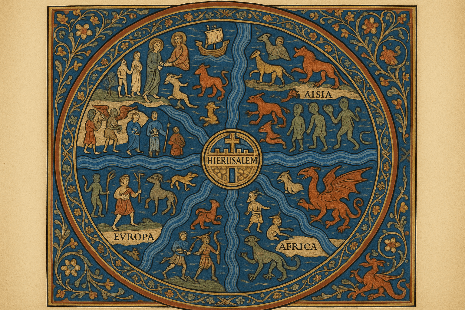
The World as a Symbol: The T-O Map
During the early Middle Ages in Europe, the most common form of world map, or mappa mundi, was not designed for a sailor but for a student of theology. This was the T-O map, a simple, elegant, and deeply symbolic representation of the world. Imagine a circle (the ‘O’), representing the world ocean-encircling the singular landmass of Earth. Inside this circle, a ‘T’ shape formed by major waterways—the Mediterranean Sea, the Nile River, and the Don River—divides the land into three continents: Asia, Europe, and Africa.
These maps were not navigational charts. Their primary function was to provide a spiritual and historical framework. Key features included:
- Orientation: East was always at the top, as “to orient” literally means “to face East.” This placed the Garden of Eden, believed to be in Asia, in the most prominent position.
- Jerusalem at the Center: At the intersection of the ‘T’, the city of Jerusalem was often depicted as the navel of the world (umbilicus mundi), the focal point of Christian faith and history.
- Biblical Geography: The three continents were assigned to the three sons of Noah—Shem (Asia), Japheth (Europe), and Ham (Africa). The map was a visual catechism, telling the story of salvation history.
The famous Hereford Mappa Mundi (c. 1300) is a spectacular and complex example. It’s a riot of detail, packed with biblical events, fantastical beasts, and classical mythology, all arranged within this theological T-O framework. To look at it is to understand the medieval mind, where the spiritual and physical worlds were inextricably linked.
The Rebirth of Science: Ptolemy’s Geographia
While the T-O map dominated medieval thought, a revolutionary text from the ancient world was waiting to be rediscovered. Claudius Ptolemy, a Greek scholar working in Alexandria, Egypt, in the 2nd century CE, had written the Geographia. This wasn’t a map itself, but a comprehensive treatise on how to make one. It was a stunning intellectual achievement.
Ptolemy’s radical idea was to map the world on a grid of latitude and longitude. He compiled a list of some 8,000 known places with their approximate coordinates. His system allowed for a scientific, scalable representation of the known world based on data and mathematics, a stark contrast to the symbolic T-O map.
However, Ptolemy’s knowledge was limited. Working with traveler’s tales and estimations, he made a few crucial errors:
- He underestimated the Earth’s circumference.
- He vastly overestimated the longitudinal width of Eurasia.
- He depicted the Indian Ocean as an enclosed lake, believing Africa’s southern coast curved eastward to connect with Southeast Asia.
Lost to Western Europe for a thousand years, Ptolemy’s Geographia was rediscovered and translated into Latin around 1406. It caused a sensation. The printing press spread copies across Europe, complete with newly drawn maps based on his instructions. This rediscovery fundamentally changed cartography, shifting the focus from theology back to science. Ironically, Ptolemy’s errors were enormously consequential. His smaller Earth and sprawling Asia made Columbus believe a westward voyage to the Indies was not only possible, but practical.
The Sailor’s Secret: Portolan Charts
While scholars debated Ptolemy and theologians contemplated the T-O map, sailors were busy creating an entirely different kind of map: the portolan chart. Appearing in the late 13th century, these charts were masterpieces of practical navigation, focused on the coastlines of the Mediterranean and Black Seas.
Their most striking feature is a spiderweb of intersecting lines, known as rhumb lines. These lines radiate from a series of compass roses scattered across the chart, representing the 32 directions of a mariner’s compass. A sailor could lay a straight-edge from their starting point to their destination, find the rhumb line that ran parallel to it, and follow that single compass bearing to navigate the sea.
Portolan charts were astonishingly accurate in their depiction of coastlines—so accurate that some details weren’t surpassed until the 18th century. They were a tool of commerce and survival, stripped of religious symbolism or scientific theory. The interiors of continents were left blank; if you couldn’t reach it by boat, it didn’t matter. The existence of portolan charts alongside mappae mundi shows that people in the pre-modern era were perfectly capable of using different maps for different purposes—one for the soul, one for the ship.
Worlds Beyond Europe
Of course, Europeans were not the only people mapping their world. Islamic cartographers, who had preserved and built upon Ptolemy’s work, created incredibly advanced maps. The most famous is the Tabula Rogeriana, created by Al-Idrisi for King Roger II of Sicily in 1154. It was a massive work of geography, far more detailed and accurate than any contemporary European map, and notably, it was oriented with South at the top.
In East Asia, Chinese cartography had its own long and sophisticated tradition. Maps like the 1402 Kangnido map blended Chinese knowledge with information from Islamic sources, creating a startlingly complete, if distorted, image of the Old World, including recognizable outlines of Korea, China, Africa, and even a sliver of Europe.
A World Re-Drawn
When Gerardus Mercator created his 1569 projection, he was building on all these traditions. He used Ptolemy’s scientific grid, combined it with the practical rhumb lines of the portolan charts, and adjusted it for a spherical Earth. The result was a map where any straight line was a line of constant compass bearing, revolutionizing long-distance ocean navigation.
Looking back at the maps that came before Mercator is a powerful reminder that every map is a product of its time. They are not simply “inaccurate” drawings of the Earth. They are rich historical documents that reveal what people knew, what they believed, and what they valued most. They show us not just one world, but many worlds, all mapped from a unique point of view.